Arjowiggins Inuit
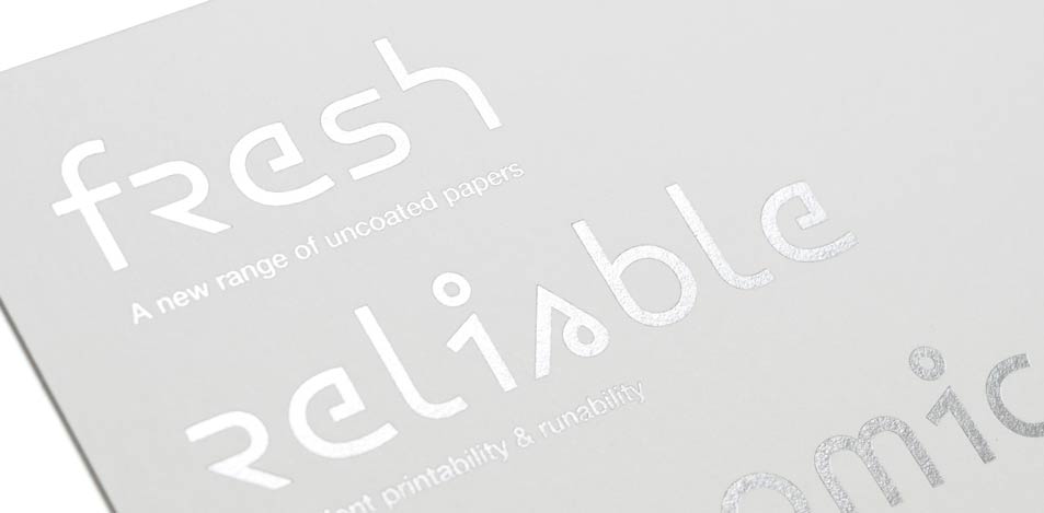
1. Promotional card using the Argowiggins Inuit font, foil blocked
Inuit is a range of premium white uncoated papers developed by Arjowiggins.
For the introduction of the paper range, we were approached by UK design company Blast to design a typeface to feature as part of the launch branding. Our brief was to develop an English readable type derived from the shapes used in the printed Inuktitut language.
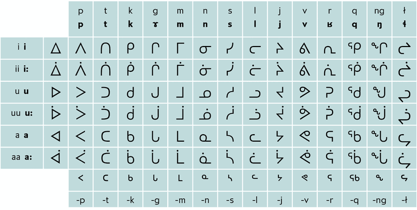
2. Grid displaying the Inuktitut syllabary
The Inuktitut syllabary is based on the Cree syllabary devised by the missionary James Evans. Specific information on syllabics can be read at Tiro Typeworks who have also published fonts for use.
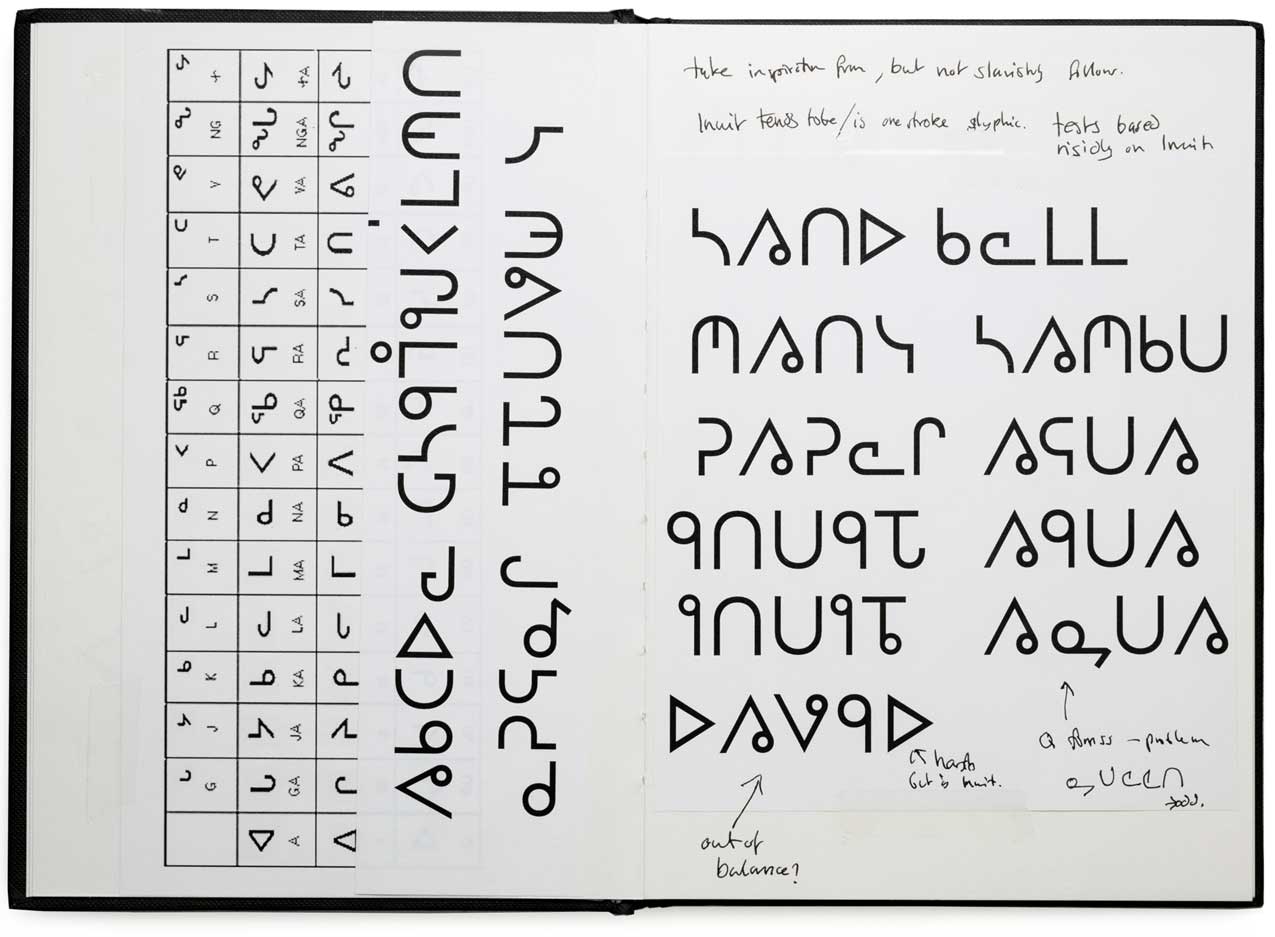
3. Development notes utilising the Inuktitut symbols that most closely resemble alphabetic letters
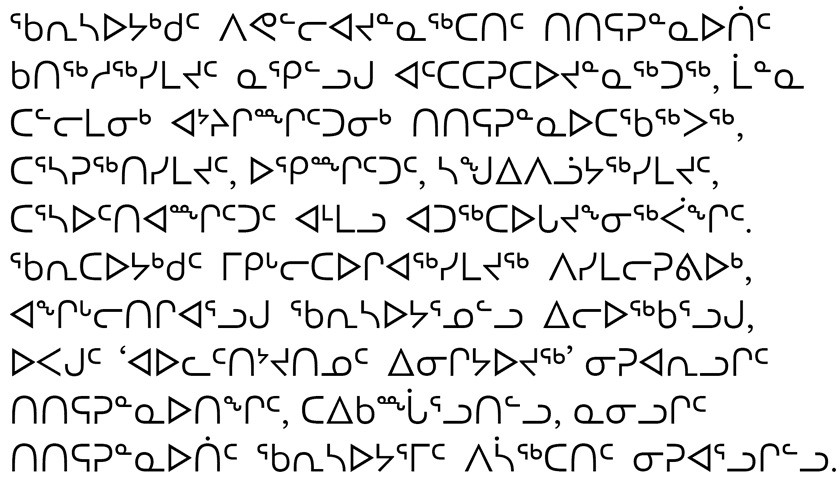
4. Example showing the Inuktitut language using the Pigiarniq font designed by Tiro Typeworks
The Inuktitut character set comprises of a set of large symbols that represent different sounds in the Inuit language [fig 2]. The same symbols are rotated or flipped to represent different sounds. There are also smaller shapes, positioned above the centre in a similar fashion to superscript [fig 4].
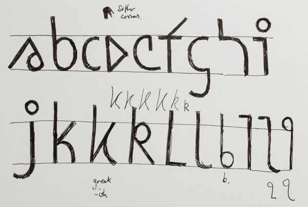
5. Adjusting the character set to incorporate ascenders and descenders

6. Example sketch of AW Inuit letters
When developing the typeface, early ideas involved directly using those syllabic shapes that were most similar to alphabetical ones [fig 3]. However, the patterning proved too disruptive for our own language. Several of the symbols could be utilised, but needed to be redrawn to conform to our alphabetical structure. Adjusting the shapes to incorporate a stronger impression of ascender and descender instantly made the symbols more alphabetical [figs 5, 6]. The character set was developed along this basis by using several key shapes and ideas found in the Inuktitut script [fig 7].
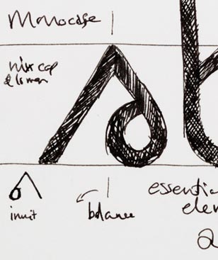
7. The a is closely based on the Inuktitut symbol for the ‘vi’ sound

8. Ideas to mark a capital letter were dropped because all capital setting would be visually messy
Different ideas were tried to enhance the visual pattern in text setting. One idea was to use a marker based on the smaller symbols seen in Inuktitut to mark when a character is repeated, such as double ee [fig 9]. However, this clashed with ascenders, i and j dots as well as accents, so the idea was discarded. In the end just the i and j dots together with punctuation and accented characters create enough of a visual texture. Punctuation and numbers were designed to match the developing visual language, and the final character set strikes a balance between the syllabic system and our own alphabetical structure.
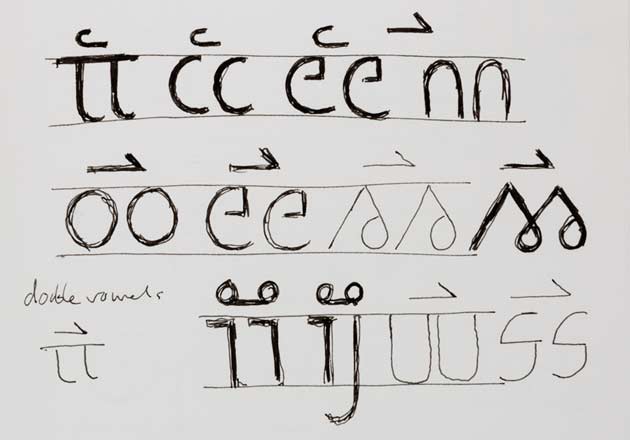
9. Possible use of a top marker to denote double letters
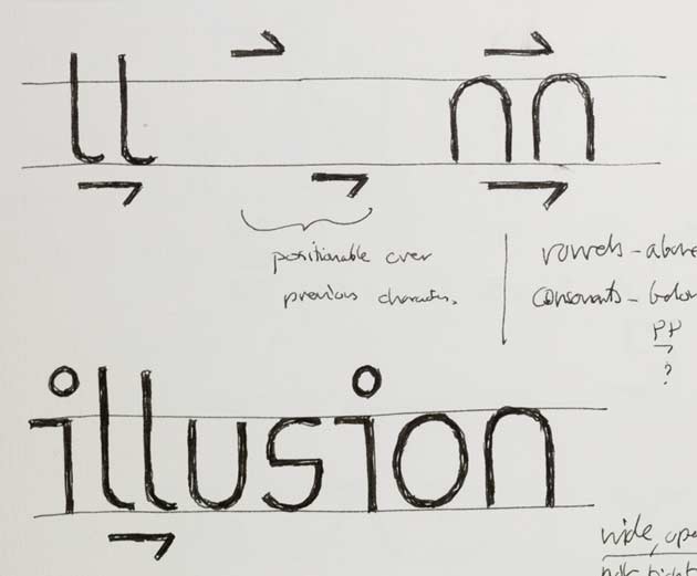
10. The marker idea was tested below letters to avoid clashes with ascenders and accents
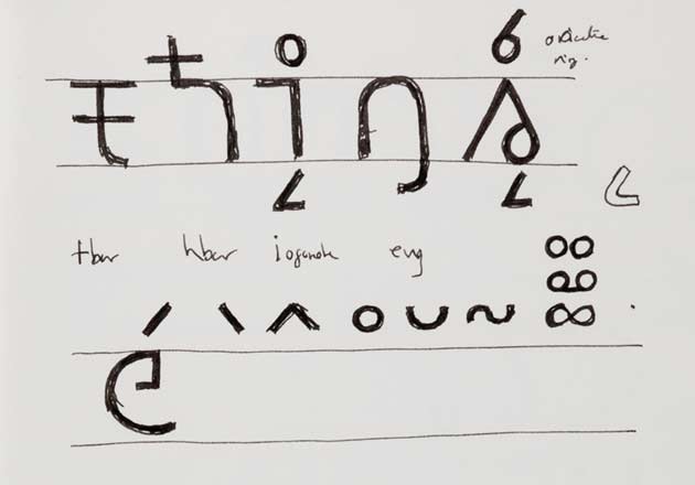
11. Additional accents were considered in the event that the character set needed to be increased to support more languages
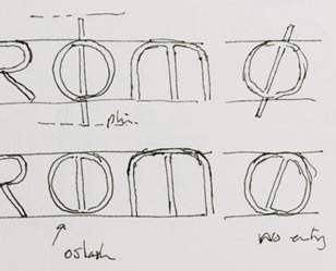
12. Development sketches of the letter ø
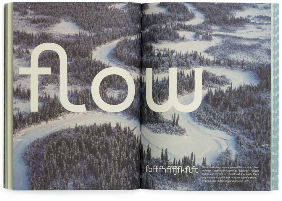
13. Page spread from The story of Inuit book celebrating the launch of the Inuit paper and typeface
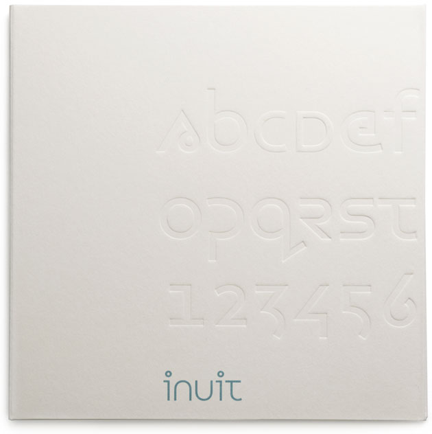
14. CD packaging for the Arjowiggins Inuit font
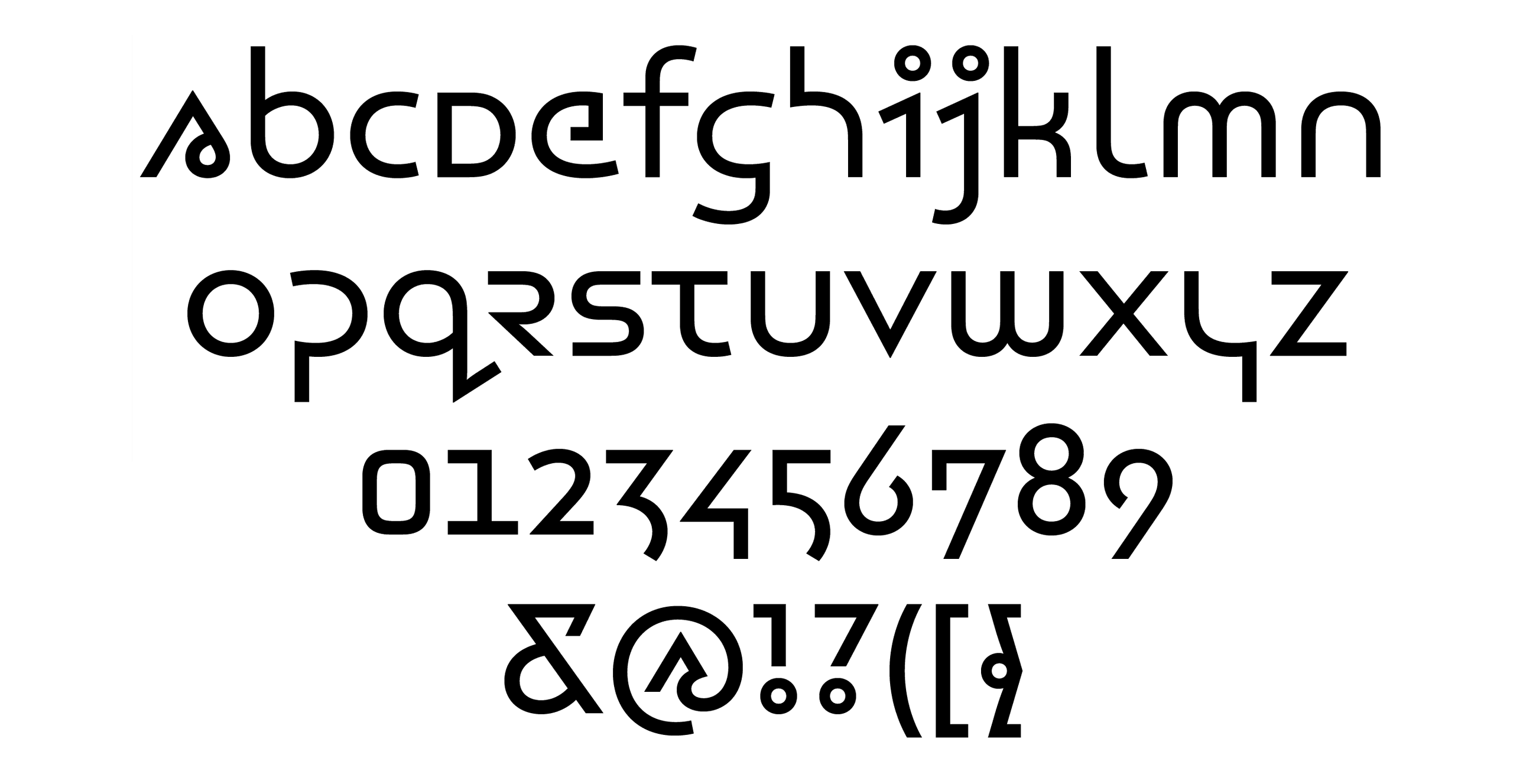
Typeface details
Arjowiggins Inuit is a single font with 279 glyphs
Read more in Footnote 41 and Footnote 05
You can license the font at typography.net
Completed 2006
